You have 1 article left to read this month before you need to register a free LeadDev.com account.
There is one thing that I always want to build, no matter what organization I join: a world-class team, performing at its peak level sustainably, even as it scales.
But from my experience as a Director of Engineering at Reciprocity Labs, as my teams grew I had less and less visibility into what was really going on. Add into the mix the fact that my teams were remote and distributed across San Francisco, Denver, Argentina, Slovenia, and Serbia – I had an interesting challenge.
In order to build a high-performing organization, I wanted to have a good measurement to know whether we were going in the right direction or not, and assess if we were doing better than last year/quarter/month. I wanted something I could show to the teams and steer them with. And bonus points if I could summarize that into a single number so I could have a quick dashboard for the whole engineering organization.
So what are the traits of high-performing teams? How do you measure them? I threw myself into books and research by large, successful companies, talked to as many fellow VPs and great leaders as I could find, and found out that there is no single good metric to rule them all (duh). That was kind of expected, but I also found that in order to measure something, you can track multiple imperfect metrics instead of finding one perfect one.

So I settled on a few metrics and a special system to track them. Then I joined them on a single dashboard and aggregated them to get a single number. This number could then be put on a nice little dashboard – with pretty charts!
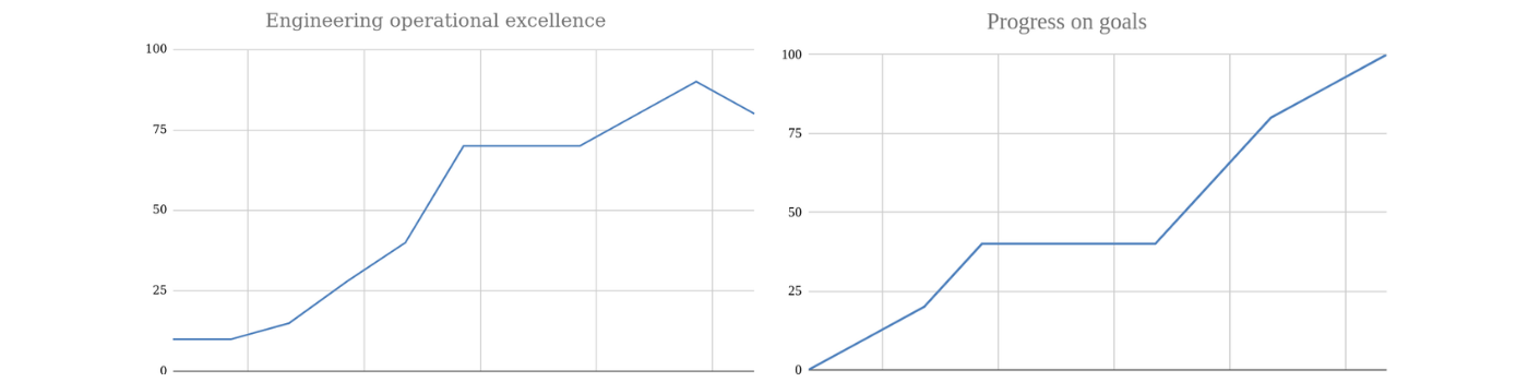
With these two charts, I was able to see our performance as an organization, how we were doing on achieving goals, and also track this over time.
The detailed dashboard helped me identify problem areas at a glance as they would shine bright red.
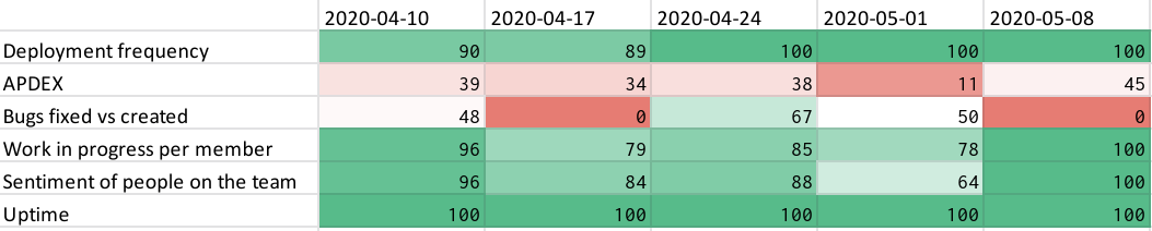
So how did we construct these dashboards and charts? It’s pretty simple: for any metric that we wanted to track we added a row in the spreadsheet, for example, ‘deployment frequency’ in the image above. We populated the row with the raw number every week, for example, in that week we deployed four times, seven times, three times. And we set two thresholds for it: best case – we deployed twenty times that week, and worst case – we had just one deployment that week. We then used these thresholds to normalize the raw number between 0 and 100%.
When all of the metrics are normalized it allows us to average them in a single number that you can see in the chart above, and we can ask ourselves, ‘From 0 to 100% how are we as an organization doing?’
We separated the metrics into two categories based on a few questions. Operational excellence:
- How are we doing compared to the best teams in the world?
- How is our infrastructure holding up?
- How are the teams doing?
And goals:
- How are we doing on our goals?
How are we doing compared to the best teams in the world?
The first four metrics are straight from the book Accelerate, where they break down high-performing organizations. If you haven’t read it already, you really should! It’s one of the books that influenced my management strategy a lot in recent years. From the list below, service level objectives and APDEX are the ones we added after we saw a need for them in our team to keep us focused.
- Deployment frequency. We simply logged each deploy to production, and summarized that per week.
- Lead time for changes. After a piece of code is merged, we measured how long it takes to appear in production.
- Change fail rate. How many deployments per week need to be rolled back?
- Time to restore service. When something in our system fails, how long did it take us to fix it?
- Service level objectives on P0 and P1 bugs. As an organization we agreed on a few timelines for critical issues that we then tracked:
- P0s should be fixed in 24h;
- P1s should be fixed in 3 days.
Lower priority bugs were left to the teams for a time when (if ever) they could fix them.
- APDEX. Is our app fast enough for the users? This is an open standard for measuring application performance described here.
The point is that the first two metrics ensure fast flow, and they are counterbalanced by the second two which ensure quality. The last two made sense for us at the time when we wanted to make sure our application worked well. The best teams in the world excel in all of the above metrics.
How is our infrastructure holding up?
Our teams used these metrics on a daily basis for alerting, but I also summarized them every week to get a quick overview of how we were doing.
- Uptime for services. This one is very straightforward, we have SLAs that we need to hit.
- Error rates. As we increase the speed of delivery, are we keeping error rates low?
How are the teams doing?
We measured a few things that should correlate to the performance of teams. This is a sensitive topic where you should tread lightly to make sure you don’t push the teams in the wrong direction.
Average time to merge a pull request
We had a problem with pull requests taking forever (three days on average) to merge. Some would even just sit there for weeks. The teams complained, and we had numerous retrospectives on this topic throughout the years, but we were never able to change this significantly. It all changed when we started actually tracking this number.
Number of pull requests opened per member
This sounds a bit too micromanage-y, but if you think about it in the frame of what behavior you want to incentivize, I think it makes sense. Our main goal was always to have the teams push small chunks of work into production to help improve the metric above. The goal here was to try and get us to a cadence of one pull request per dev, per day, or more.
Bugs fixed vs found ratio
Our philosophy is that teams own the systems they develop which means they are responsible for fixing their own mess – i.e. bugs on their systems. The goal was to always have a positive ratio of fixed vs found. This is a metric where we set the balance based on business priorities. Sometimes you can afford to fix all the bugs, sometimes you can’t, and our goal here was to have a positive ratio. We could also break these goals down by bug priority.
Work in progress per member
A standard feature of Kanban is that you have limits to the amount of work you can have in progress to ensure smooth flow, so we tried to measure that for a team.
For each person, you can calculate how many tasks they have in progress on a single day. We counted any task that was in progress or in review (code review or QA check), i.e. a task that had been started but was not merged yet.
Sentiment of people on the team
We used a simple weekly survey that had a few questions and one of them was, ‘From 1-5 how did you feel at work this week?’
A starting point
Team metrics are a very sensitive topic because you can promote the wrong incentives very easily, so the way I always used them was mostly just as a starting point for conversations with teams or their managers, like, ‘Hey, I noticed that your team has a lot of work in progress and your bug counts are increasing, is everything OK? Do you need any help?’
How are we doing on our goals?
Progress on Objectives and Key Results (OKRs)
We subscribed to the OKRs philosophy, so every quarter we set goals with the engineering team. These included a few top-level goals, which were then supported by goals each of the teams constructed in classic OKR style. Every week, the teams would update their progress on their OKRs and we would aggregate them.
We tracked goals separately from the operational metrics, as you can see in the images earlier on in this article.
Our outcomes
These dashboards allowed me to see most of the things I needed at a glance, no matter where the team was located. Any number that looked odd would pop out in bright yellow or red colors in the reports (see above), allowing me to focus my attention easily and check in with the teams. It’s very important to never use these metrics in any compensation discussions so everyone can try and ‘game the system’. Though on the other hand, if the metrics are set up well, ‘gaming the system’ just means the teams are doing more of the right things.
For example, there was an air of satisfaction amongst our teams when they slashed the time that tests needed to run, and our lead time number visibly dropped. It was great to see the average time to merge a pull request dropping, deployment frequency increasing week by week, and at the same time see our reliability growing. Another highlight was when the team was able to fix a customer issue in 20 minutes compared to the 20 hours it took them the first time. When the system really started working, we reached a point where we didn’t even have any P0 bugs in production for six months.
When we started using these metrics, our main focus was to go from releasing every two weeks to deploying anything that had been merged to production. This allowed us to measure every step of the journey, and also gave us good opportunities and clear points of when to celebrate milestones.